loader image

The Importance of Attention to Detail in Web Design

On average, users spend less than 15 seconds on a website before deciding whether to stay or bounce. They’re essentially scanning and skimming through the content until they find what they’re looking for. If something catches their attention or sustains their interest, they will spend more time and may even complete a call-to-action or two.
In that quick span of time, users can already form first impressions—good or bad—which can have a significant impact not just on the overall user experience but on the company’s bottom line as well. This is where attention to detail plays an important role in web design. While it’s pretty much a universal belief that content is king, it’s the details that make or break a website.

Beauty is in the Details

Detail-oriented web designers pay close attention to the small details because they know that the little things can help enhance the user experience as they interact with the website. It’s no different from companies giving attention to the tiniest details and putting them into a product. It creates excitement and anticipation. Taking care of the small details means considering users’ expectations and ensuring that they have a great experience while using the site.

Small but Significant Details

Making your website visually appealing goes hand in hand with functionality and usability. Web developers focus on these elements to make sure that there is a balance between features and aesthetics. This balancing act must also ensure that all elements work together seamlessly. However, in the process, some web professionals—old and new—tend to overlook the small but significant details that create a positive user experience.

Consistency

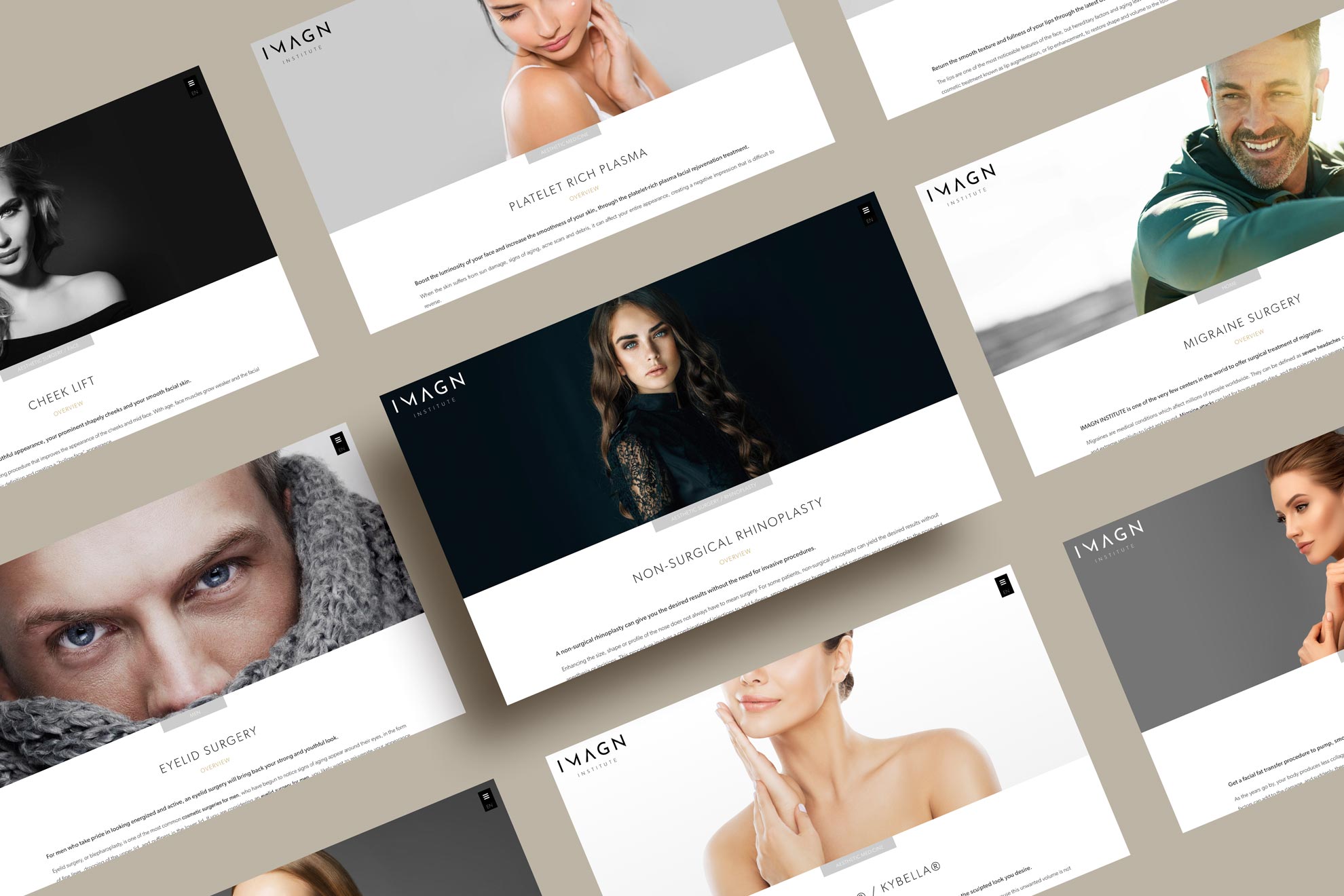
Websites must maintain a specific look and feel depending on the branding, message, or theme that the company is aiming for. To create cohesiveness, certain elements should remain consistent across the entire website. This includes using color schemes, font types, alignment, and other style elements.
Consistency in the layout makes it easy for users to understand the concept of the website, in turn, making the website more intuitive. A design that makes sense to users greatly increases interaction and engagement, both with the website itself, and with the brand or company.

Contrast

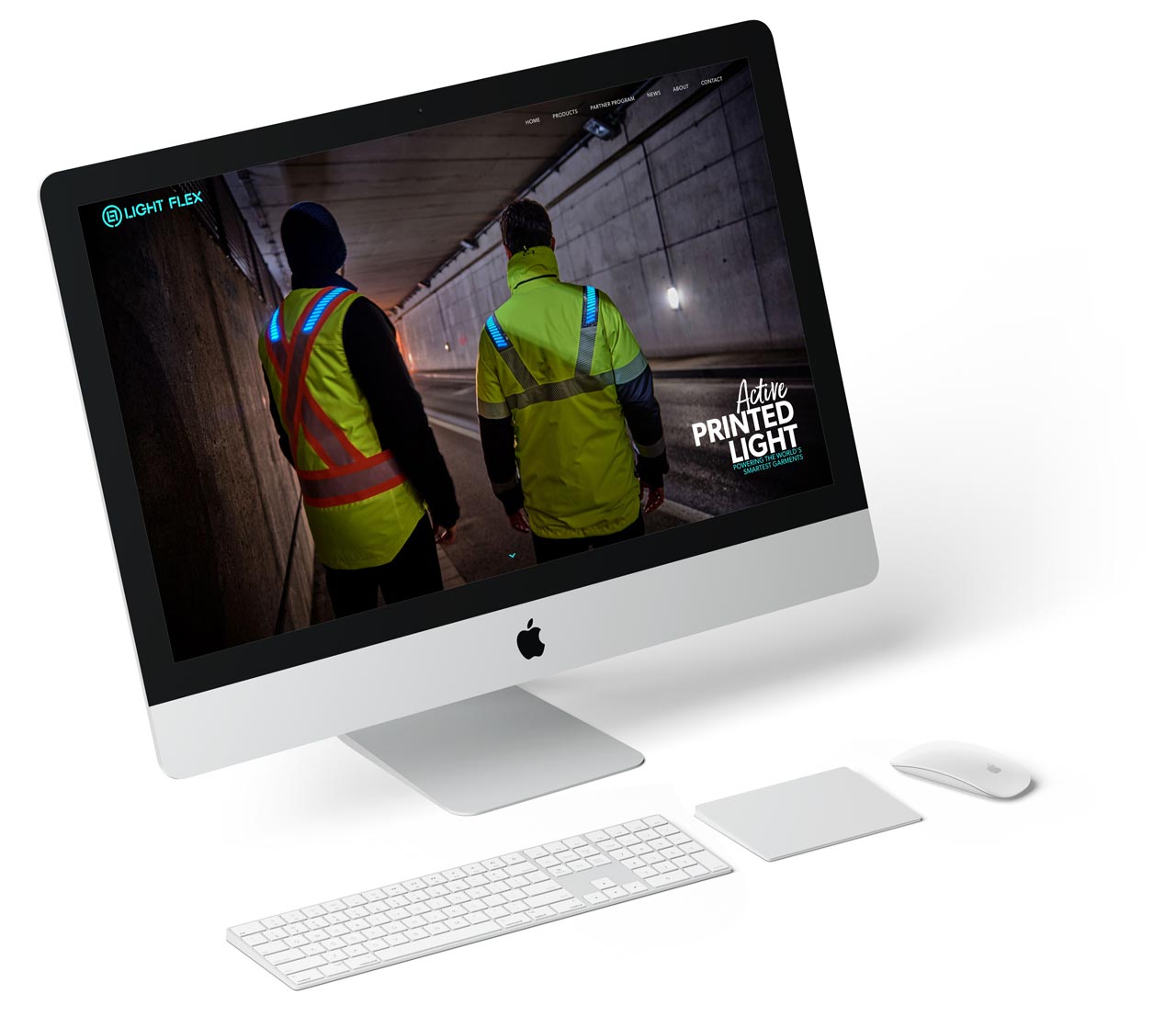
Using contrast can make important design elements stand out. In a way, you are creating a focal point that draws the attention of site visitors. By creating a contrast, you are essentially telling people where to look first.
Whether the design is minimalist or elaborate, contrast works to establish visual interest on specific areas on the website. This is done through the careful manipulation of differences in colors, spacing, alignment, typefaces, and other design elements.
Color contrast is a widely used technique not only to establish branding but also to put emphasis on the important sections of the website. The stark contrast between bright and dark colors will immediately draw the attention of users. Setting certain keywords in bold or in a different color is also a type of contrast used to drive home a point.
Contrast also helps establish some form of hierarchy. It tells the user which elements are important and need to be viewed first. In this case, size contrast is typically used. For instance, the size variation in title and subtitle helps the user recognize the main topic or focus of the content.
In some cases, web designers use space to emphasize the image or element that is important. The amount of space that separates different elements defines their relationship. Relatedly, scale contrast is also commonly used to make an element stand out so that the eye just intuitively recognizes it as something much more important than the other elements in the site.

Less is More

Designers will often overdo their website designs by overcomplicating things with way too many drop shadows, borders, fonts, colors, and other elements. This creates a cluttered appearance that they may be able to get away with in print, but not so much when read on a computer or mobile. When there’s too much going on on a page, it defeats the purpose of wanting viewers to stay and explore more of your website. A cluttered page will likely turn viewers off and cause them to quickly want to exit your site.
Placement is also very important. Random placements of images, content, and other elements will make the website look cluttered. Without proper planning and keen awareness of successful web design elements, the website may end up being too “busy”. This happens when web designers overdo things by adding components that are unnecessary or excessive. When there’s too much happening on the pages, it can overwhelm users and give them a negative experience.
Even as website design techniques evolve and better design tools are introduced, the principles of good web design remain. Successful websites are fundamentally sound because all the small details across elements are executed well. This allows the website to become an effective and efficient touchpoint where customers can interact with the brand or the company. It balances the design elements which enhances the content legibility, increases engagement, and improves user experience.

8 Tips for Climbing the Ranks of Google

Let’s face it, you’re not the only one that wants their website at the top of Google search results. Every single one of your competitors would love that top spot on the first page just as much as you do.

Read more
Ready to take your
business to the next level?
Let’s work together