Clean, modern and elegant website for one of the leading beauty, migraine and wellness centers in Europe, IMAGN Institute
Barcelona, Spain
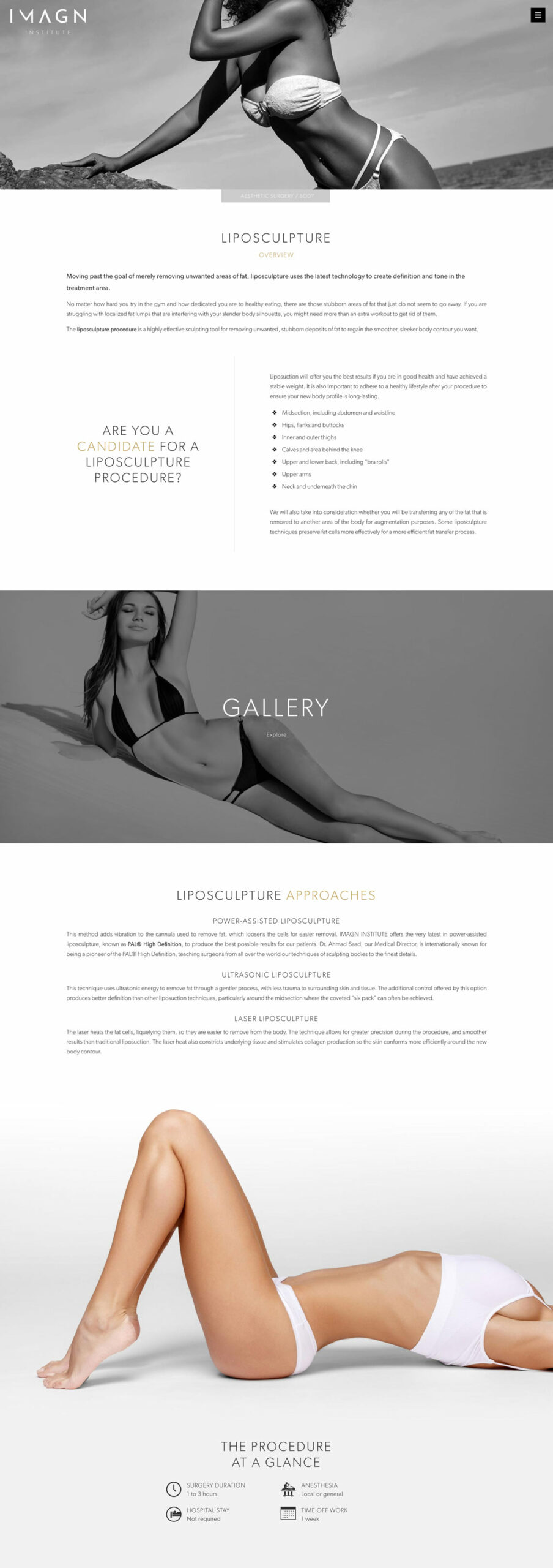
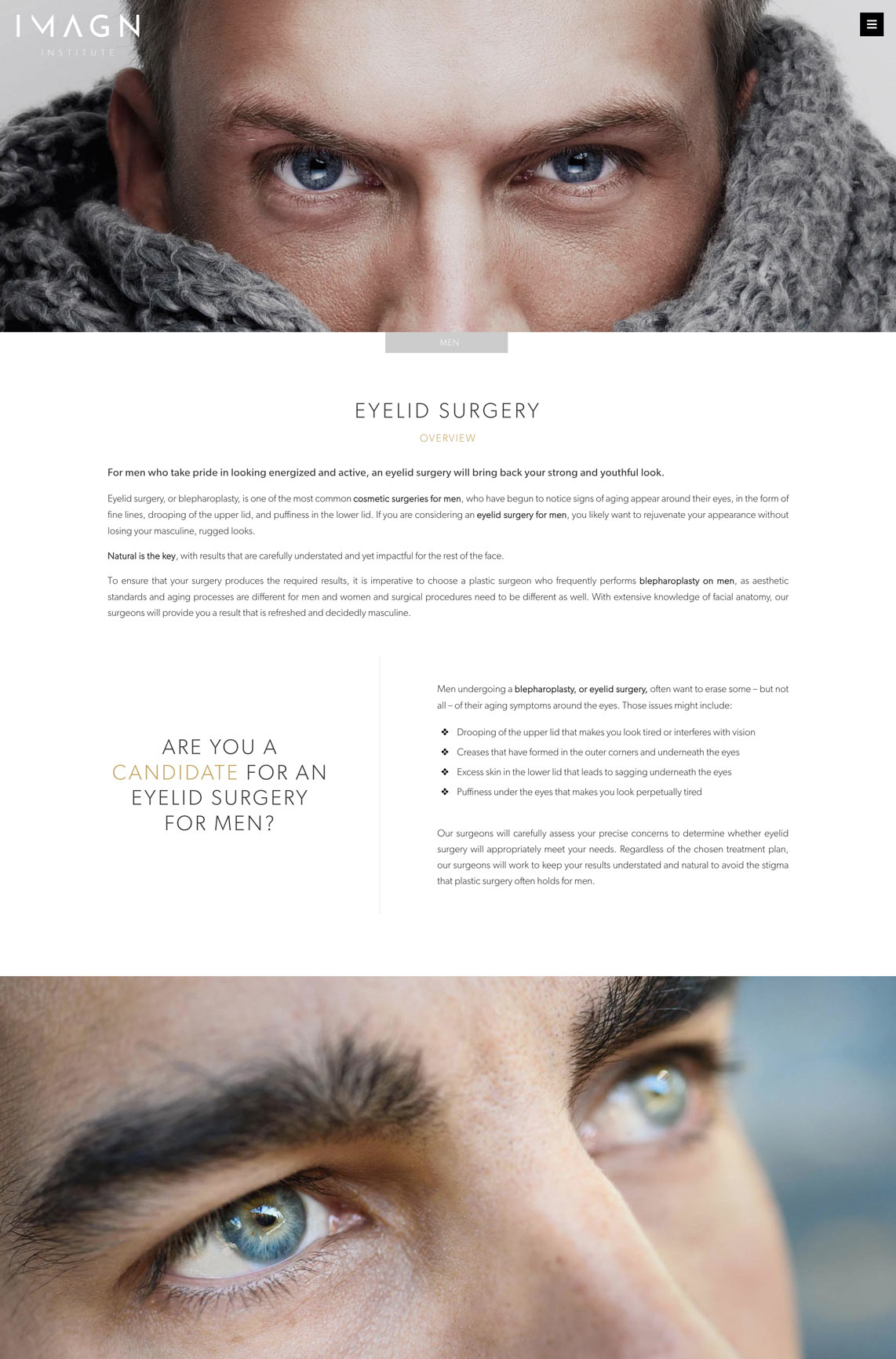
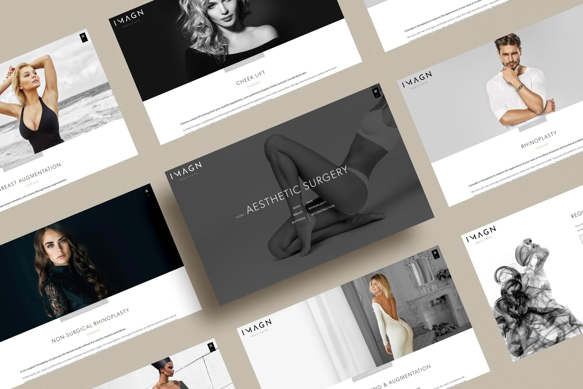
Beauty. Grace. Elegance. These three words are synonymous with IMAGN Institute. The challenge was how to portray these attributes in a website, a logo and the brand’s identity.
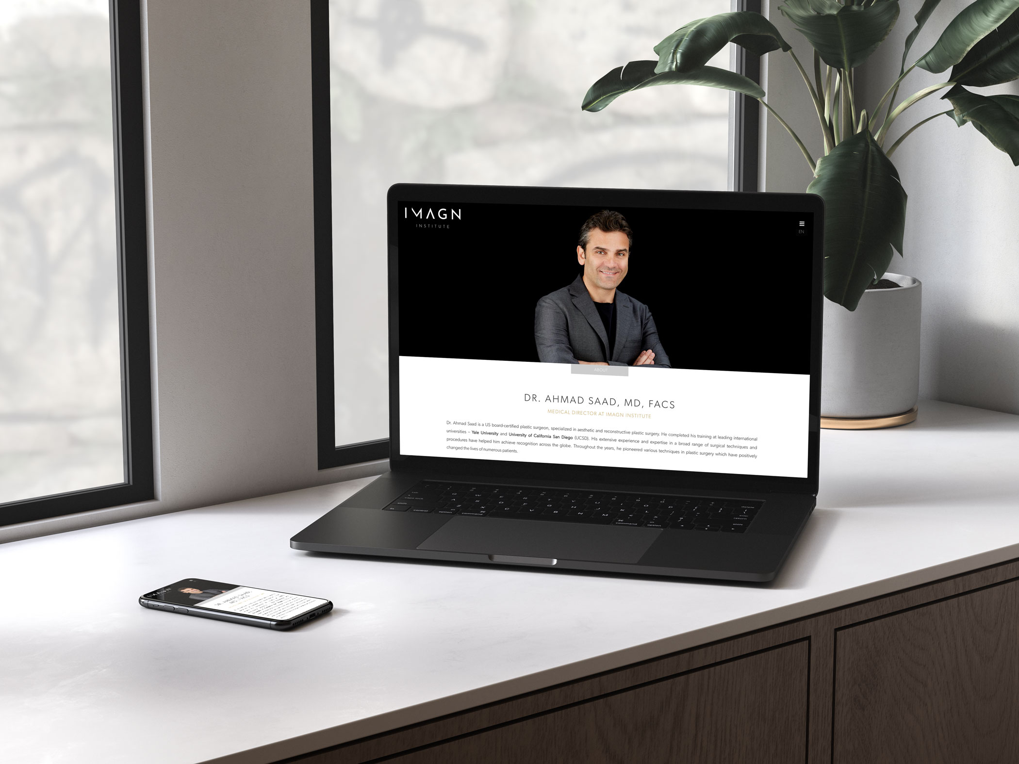
Some of the website’s features include beautiful fullscreen images, the use of subtle motion on the before-and-after pages, creating a very unique look and feel, and the ability to make payments for the Master’s Course, directly on the website.
In order to assist patients in understanding all of the terms and procedures, the over 100-page website is viewable in six languages; English, Spanish, Catalan, French, Russian and Arabic.
White Space
White space, also referred to as negative space, is one of the six principles of design. The use of white space provides the IMAGN Institute website a sense of “breathing room”. White space greatly improves content legibility and creates a feeling of balance, in turn, making the website much more appealing and engaging to interact with.

Logo Design &
Business Card Design
The logo needed to reflect IMAGN Institute’s positioning as a high-end center of beauty and wellness, offering a very high level of service and personal attention. The logo created is simple and elegant – but distinct and highly recognizable.
The business cards feature a QR code that allows patients to easily connect to the IMAGN Institute website by simply scanning the QR code with their smartphones.

I have been working on building a personal/business website for three years during which I have worked with three different web development and design companies from three different countries. I have cancelled the work with all three companies because either incompetency or they could not keep up with the commitments we agreed upon initially. Before I met with Paolo in person, I looked over his portfolio and what I found incredible is that no two sites look the same, and each website was elegantly designed with creativity and precision to fit the mission of the website/person.
I decided to commit and work with Paolo, and I think that was one of the best decisions I have made. After spending a lot of time together, listening to my requests, running ideas by me, he created an elegant and very responsive website in six languages. He is very knowledgeable in development with an artistic creative eye, and when he commits to your project, he puts his heart and soul to deliver the best product possible. I cannot recommend Paolo enough for your project.
I decided to commit and work with Paolo, and I think that was one of the best decisions I have made. After spending a lot of time together, listening to my requests, running ideas by me, he created an elegant and very responsive website in six languages. He is very knowledgeable in development with an artistic creative eye, and when he commits to your project, he puts his heart and soul to deliver the best product possible. I cannot recommend Paolo enough for your project.
Dr. Ahmad Saad
Founder / Medical Director, IMAGN Institute
Brand creation
and identity formation
The brand identity for IMAGN Institute was greatly influenced by the golden ratio, a mathematical ratio commonly found in nature. The golden ratio evokes visual calm and aesthetic perfection which helps generate a comfortable and sophisticated feeling.
We chose bronze as the main accent color for the brand for the color bronze symbolizes strength and support and is a color that motivates, soothes and inspires – a perfection match with what IMAGN Institute represents.
Interested in
working together?
Let’s talk about
your project
Fill out the form below and we will get
back to you as soon as possible.
back to you as soon as possible.
We inform you that your data will be incorporated into the treatment system owned by NEPTUNE DESIGN SL with NIF B56807696 and registered office at Carrer del Rosselló 198 4º 2ª, 08008 BARCELONA in order to answer your questions.
Purpose: to manage the sending of information and commercial prospecting, related to our services and/or products. Legitimation: consent of the interested party. Recipients: data will not be transferred to third parties, unless legally required. Rights: you may exercise your rights of access, rectification, limitation of processing, deletion, portability and opposition to the processing of your personal data, as well as the withdrawal of the consent given for the processing thereof. Additional information: detailed information on Data Protection can be found on this page.
Inzone Design © 2024 All Rights Reserved | Legal Notice and Privacy Policy
